IN MY FIRST week of design school, I found myself riding Austin’s notoriously limited public transit system, asking fellow riders why they used it, what would encourage them to ride more often, and what they would change about the service.
After a handful of interviews, my rides yielded an unexpected insight: Users didn’t like Capital Metro’s expanded hours and new bus routes. The changes, implemented in June, were ostensibly for the riders’ benefit. But people’s routine included a strong aversion to change. And for a population already dealing with a rapid rate of change in their city, the new routes were especially disorienting.
Any externally forced change can represent an existential threat—as we know all too well from our daily news cycles. Even something as small as the sudden restructuring of our—or our kids’—commute can throw our perceptions of relational, financial, or political safety into jeopardy.
We’re in a wearying time. And looking at CapMetro users’ responses, I began to wonder whether we can build levity into a daily commute as a form of comfort blanket for these users. How can we offer delight as an antidote to people who are really, really weary of change?
Designer Ingrid Fetell Lee has been studying the effects of joy and delight in our civic practices. She has found that consistent “aesthetics of joy”—bright color, rounded shapes, a sense of abundance—translate across age, race, and gender. People universally report feeling delighted, inspired, comforted, reassured, and safe in the presence of these aesthetic touches.
“Then why does so much of the world look like this?” she asked in an April 2018 TED talk as she showed slides of beige cubicles and desks, grey school lockers, and rows of dark, rectangular office buildings. “Why do we send our kids to schools that look like this? Why do our cities look like this? And this is most acute for the places that house the people that are most vulnerable among us: nursing homes, hospitals, homeless shelters, housing projects.”
Some public buildings have begun intentionally incorporating the aesthetics of joy, notably in Publicolor’s bright reimaginings of New York City public schools. And after the mass shooting at Sandy Hook Elementary School, the new building there incorporated features that made it not just secure, but joyful: Aluminum trees, color-paned windows, and waves over door frames all hide safety features while turning the school into a work of art.
As I work out what civic joy can mean in a time of anger and grief, I am also revisiting images made in another time—by an activist nun. In the political turmoil of the 1960s, Sister Corita Kent, IHM, saw the potential of joyful design to provoke the public conscience. An artist and educator, her work focused on poverty, hunger, war, and social justice, these urgent subjects disguised under Warholian colors, shapes, and quotes from pop songs, political slogans, and the Bible.
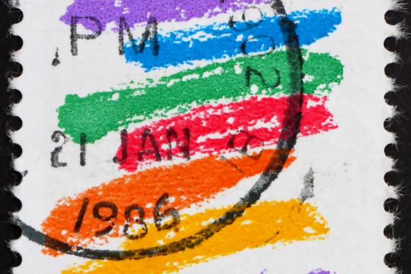
Her most famous work is her iconic rainbow-colored “Love” stamp. But perhaps her most provocative creation is an interpretation of Communion as a bright, blobby package of Wonder Bread, accompanied by a scribbled line from Gandhi: “There are so many hungry people that God cannot appear to them except in the form of bread.”
In 1983, commissioned by Physicians for Social Responsibility, Kent created a giant billboard sketch evoking blooming fields and a blue sky, declaring that “we can create life without war.” She is said to have later called the sketch the most religious thing she’s done.
Kent’s influence lives on in some public explorations of joy today. When global design company IDEO moved its studio in Cambridge, Mass., to a new neighborhood, Michael Hendrix, partner and executive design director of IDEO Cambridge, sought out an aesthetic of “calculated joy” that would reflect the spirit of the activist sister.
“Today’s headlines are a 1960s déjà vu: culture wars, social injustice, sexual harassment, mass shootings, covert ops, media corruption, political failure,” Hendrix wrote on his company blog. “I’ve personally wondered how Kent made the shift to rainbows and love, and I mean that with no irony. ... Maybe it comes down to this simple truth: Love wins.”
“The drive toward joy is the drive toward life,” said Lee. In our civic life, as in our designing, may we seek out the joy.

Got something to say about what you're reading? We value your feedback!